---
title: "Position and Layer the Teaser and Popup"
description: "Adjust the vertical offset and Z-Index of the Teaser and Popup components so they sit in the right place — and at the right depth — on your storefront."
---
The **Teaser** and **Popup** components share two styling controls that determine where they appear on the page:
- **Offset** — how far the component sits from the edge of the screen (Spacing).
- **Z-Index** — whether the component stacks in front of or behind other on-page elements (Layout).
Both controls live in the same place for each component: **Build > Components > [Teaser or Popup] > Edit > Styles > Display**. They're [component-level](/shopify/tutorials/visibility-controls#component-level-controls) styling options, so adjusting one placement doesn't affect the rest of the campaign.
## Adjusting the Vertical Offset
The vertical offset controls the distance between the component and the edge of the screen it's anchored to. A separate **Vertical (Mobile)** field lets you tune mobile independently, since storefronts often have different headers, footers, and safe areas on smaller screens.
1. Go to **Build > Components**.
2. Click the **Teaser** (or **Popup**) row, then click **Edit**.
3. Open the **Styles** tab.
4. Expand **Display**, then expand **Spacing**.
5. Under **Offset**, update **Vertical** for desktop and **Vertical (Mobile)** for mobile. You can also tune **Horizontal** here if needed.
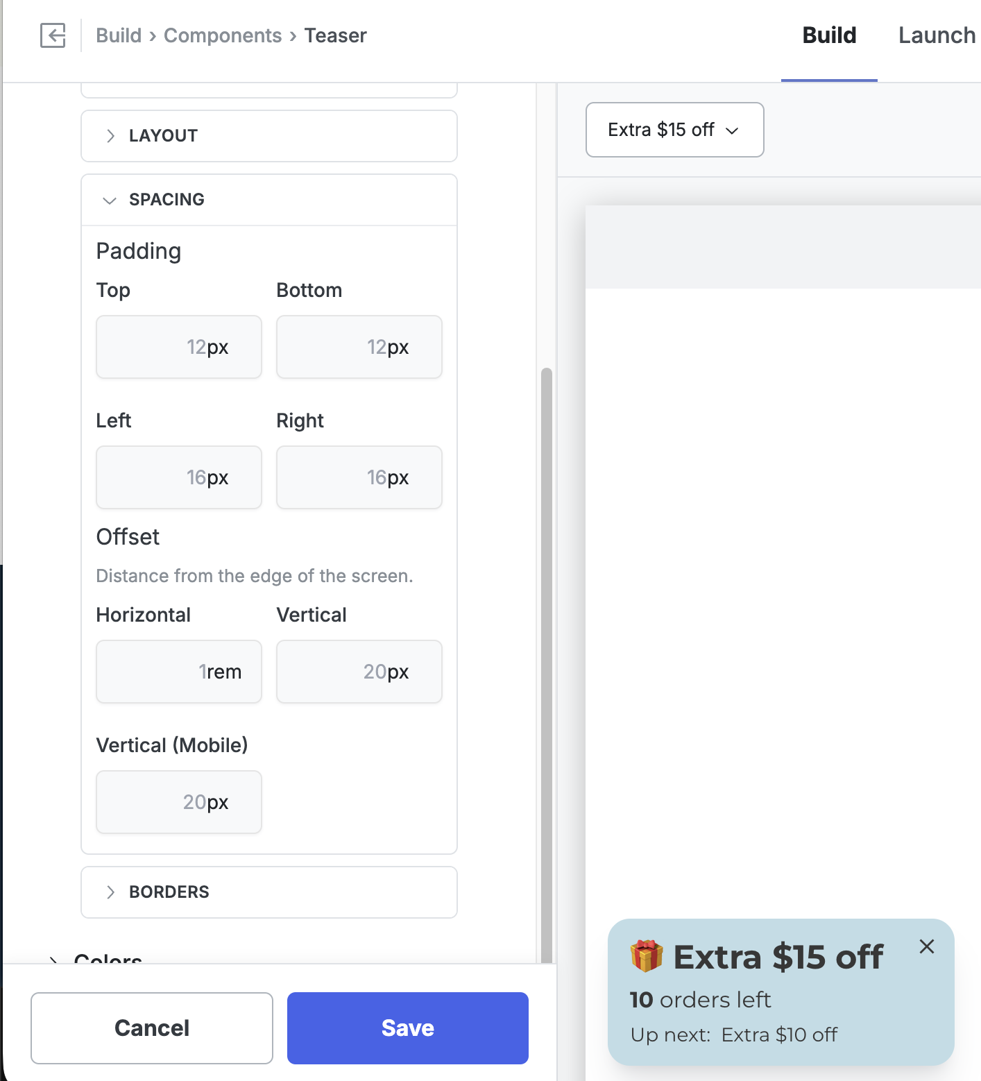 6. Click **Save** and preview the storefront on both desktop and mobile to confirm placement.
Values accept any standard CSS length unit — `px` and `rem` are the most common.
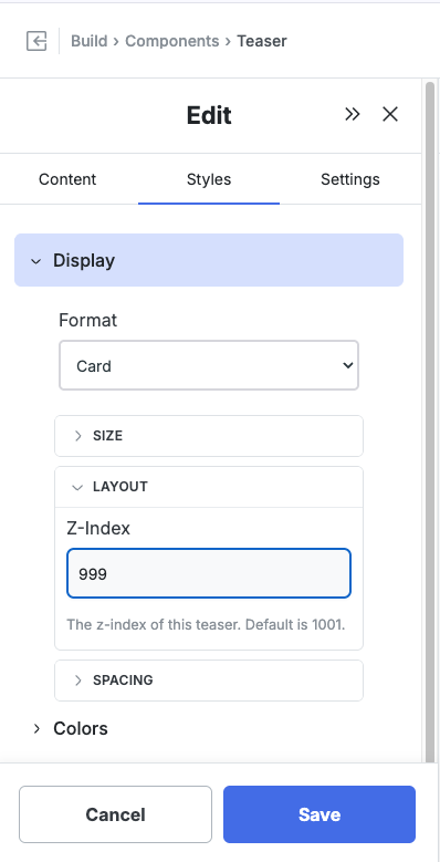
## Adjusting the Z-Index
Z-Index controls stacking order: a higher number sits in front, a lower number sits behind. Quikly components are designed to sit on top of your storefront so they stay visible, but occasionally one overlaps a piece of your theme's UI that should win instead — most commonly the **cart drawer on mobile**, but also sticky headers, chat widgets, and cookie banners.
Every Quikly component defaults to a Z-Index of **1001**, which keeps it above typical storefront content. To push a component *behind* a theme element, set its Z-Index **below** that element's z-index.
### Example: Teaser Behind the Mobile Cart Drawer
When a shopper opens the cart drawer on mobile, you usually want the drawer in front and the teaser tucked behind it.
1. Go to **Build > Components**.
2. Click the **Teaser** row, then click **Edit**.
3. Open the **Styles** tab.
4. Expand **Display**, then expand **Layout**.
5. Set **Z-Index** to a value below your cart drawer's z-index. In the example below it's set to `999`, just under the `1001` default.
6. Click **Save** and preview the storefront on both desktop and mobile to confirm placement.
Values accept any standard CSS length unit — `px` and `rem` are the most common.
## Adjusting the Z-Index
Z-Index controls stacking order: a higher number sits in front, a lower number sits behind. Quikly components are designed to sit on top of your storefront so they stay visible, but occasionally one overlaps a piece of your theme's UI that should win instead — most commonly the **cart drawer on mobile**, but also sticky headers, chat widgets, and cookie banners.
Every Quikly component defaults to a Z-Index of **1001**, which keeps it above typical storefront content. To push a component *behind* a theme element, set its Z-Index **below** that element's z-index.
### Example: Teaser Behind the Mobile Cart Drawer
When a shopper opens the cart drawer on mobile, you usually want the drawer in front and the teaser tucked behind it.
1. Go to **Build > Components**.
2. Click the **Teaser** row, then click **Edit**.
3. Open the **Styles** tab.
4. Expand **Display**, then expand **Layout**.
5. Set **Z-Index** to a value below your cart drawer's z-index. In the example below it's set to `999`, just under the `1001` default.
 6. Click **Save**, then open your storefront on mobile and open the cart drawer to confirm the teaser now sits behind it.
### Finding the Right Value
The number that works depends on the z-index your theme assigns to the element you're layering against:
- **To go behind an element**, set Quikly's Z-Index lower than that element's.
- **To stay in front**, leave the default (1001) or raise it.
If you're not sure what z-index your theme uses for the cart drawer or header, inspect that element in your browser's dev tools and read its `z-index` value, then set the Quikly component just below it. Many Shopify themes use values in the low thousands for drawers and overlays, so a value like `999` is a safe starting point for sending a component behind them.
## Advanced: Override the Offset on Specific Templates
The Offset fields apply globally to the component. If you need a different offset on just one template — for example, more breathing room on the product page so the teaser clears a sticky "Add to Cart" bar — you can override the CSS variable for that template only.
1. Go to **Build > Styles > Theme CSS**.
2. Add a rule that targets the template's body class and the component's position class. For example, to set the mobile vertical offset to `115px` on the product page when the Teaser is positioned in the bottom-left:
```css
html body:not(.q_layout_root).product-page .q_Panel_position_bottomLeft {
--q-component-mobileOffsetVertical: 115px !important;
}
```
3. Click **Save** and preview the product page on mobile to confirm.
This assumes the product page renders with a `product-page` class on the `` tag. Most Shopify themes do, but if yours doesn't, inspect the page in your browser's dev tools and substitute whatever class the template actually uses. Adjust `.q_Panel_position_bottomLeft` if your component is anchored to a different corner.
## Teaser vs. Popup
The Teaser and Popup expose the same Offset and Z-Index controls in the same locations, so the steps above apply identically to both. Adjust them independently — each component has its own Styles, so changing the Teaser's offset or Z-Index doesn't affect the Popup.
## When to Use Z-Index vs. Hiding the Component
If you want the component gone entirely on certain pages or states rather than just layered behind something, use [visibility controls](/shopify/tutorials/visibility-controls) instead — for example, hiding a placement on the cart template. Z-Index is the right tool when the component should still be present, just not on top.
## Related Tutorials
- [Campaign Visibility Controls](/shopify/tutorials/visibility-controls) — Show or hide placements by page, template, or product
- [How to Position the Banner Component](/shopify/tutorials/position-banner)
- [Show or Hide Components on Specific Products](/shopify/tutorials/product-page-targeting)
6. Click **Save**, then open your storefront on mobile and open the cart drawer to confirm the teaser now sits behind it.
### Finding the Right Value
The number that works depends on the z-index your theme assigns to the element you're layering against:
- **To go behind an element**, set Quikly's Z-Index lower than that element's.
- **To stay in front**, leave the default (1001) or raise it.
If you're not sure what z-index your theme uses for the cart drawer or header, inspect that element in your browser's dev tools and read its `z-index` value, then set the Quikly component just below it. Many Shopify themes use values in the low thousands for drawers and overlays, so a value like `999` is a safe starting point for sending a component behind them.
## Advanced: Override the Offset on Specific Templates
The Offset fields apply globally to the component. If you need a different offset on just one template — for example, more breathing room on the product page so the teaser clears a sticky "Add to Cart" bar — you can override the CSS variable for that template only.
1. Go to **Build > Styles > Theme CSS**.
2. Add a rule that targets the template's body class and the component's position class. For example, to set the mobile vertical offset to `115px` on the product page when the Teaser is positioned in the bottom-left:
```css
html body:not(.q_layout_root).product-page .q_Panel_position_bottomLeft {
--q-component-mobileOffsetVertical: 115px !important;
}
```
3. Click **Save** and preview the product page on mobile to confirm.
This assumes the product page renders with a `product-page` class on the `` tag. Most Shopify themes do, but if yours doesn't, inspect the page in your browser's dev tools and substitute whatever class the template actually uses. Adjust `.q_Panel_position_bottomLeft` if your component is anchored to a different corner.
## Teaser vs. Popup
The Teaser and Popup expose the same Offset and Z-Index controls in the same locations, so the steps above apply identically to both. Adjust them independently — each component has its own Styles, so changing the Teaser's offset or Z-Index doesn't affect the Popup.
## When to Use Z-Index vs. Hiding the Component
If you want the component gone entirely on certain pages or states rather than just layered behind something, use [visibility controls](/shopify/tutorials/visibility-controls) instead — for example, hiding a placement on the cart template. Z-Index is the right tool when the component should still be present, just not on top.
## Related Tutorials
- [Campaign Visibility Controls](/shopify/tutorials/visibility-controls) — Show or hide placements by page, template, or product
- [How to Position the Banner Component](/shopify/tutorials/position-banner)
- [Show or Hide Components on Specific Products](/shopify/tutorials/product-page-targeting)