Position and Layer the Teaser and Popup
The Teaser and Popup components share two styling controls that determine where they appear on the page:
- Offset — how far the component sits from the edge of the screen (Spacing).
- Z-Index — whether the component stacks in front of or behind other on-page elements (Layout).
Both controls live in the same place for each component: Build > Components > [Teaser or Popup] > Edit > Styles > Display. They’re component-level styling options, so adjusting one placement doesn’t affect the rest of the campaign.
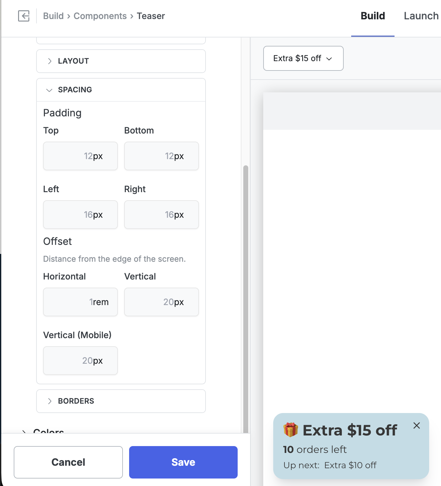
Adjusting the Vertical Offset
Section titled “Adjusting the Vertical Offset”The vertical offset controls the distance between the component and the edge of the screen it’s anchored to. A separate Vertical (Mobile) field lets you tune mobile independently, since storefronts often have different headers, footers, and safe areas on smaller screens.
-
Go to Build > Components.
-
Click the Teaser (or Popup) row, then click Edit.
-
Open the Styles tab.
-
Expand Display, then expand Spacing.
-
Under Offset, update Vertical for desktop and Vertical (Mobile) for mobile. You can also tune Horizontal here if needed.
- Click Save and preview the storefront on both desktop and mobile to confirm placement.
Values accept any standard CSS length unit — px and rem are the most common.
Adjusting the Z-Index
Section titled “Adjusting the Z-Index”Z-Index controls stacking order: a higher number sits in front, a lower number sits behind. Quikly components are designed to sit on top of your storefront so they stay visible, but occasionally one overlaps a piece of your theme’s UI that should win instead — most commonly the cart drawer on mobile, but also sticky headers, chat widgets, and cookie banners.
Every Quikly component defaults to a Z-Index of 1001, which keeps it above typical storefront content. To push a component behind a theme element, set its Z-Index below that element’s z-index.
Example: Teaser Behind the Mobile Cart Drawer
Section titled “Example: Teaser Behind the Mobile Cart Drawer”When a shopper opens the cart drawer on mobile, you usually want the drawer in front and the teaser tucked behind it.
-
Go to Build > Components.
-
Click the Teaser row, then click Edit.
-
Open the Styles tab.
-
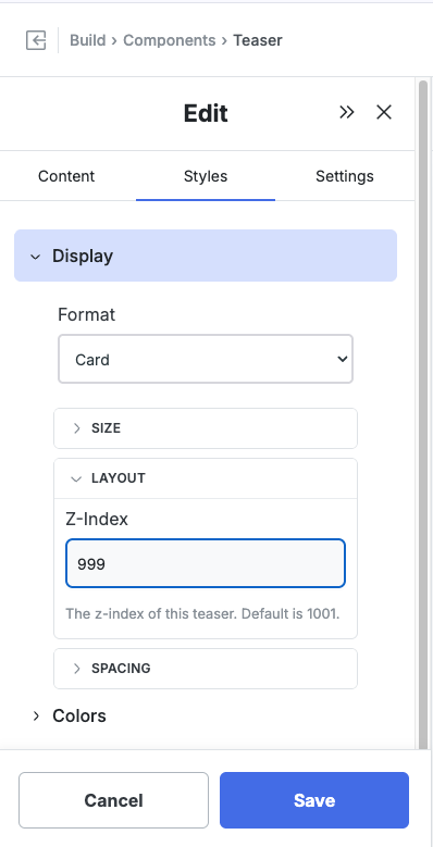
Expand Display, then expand Layout.
-
Set Z-Index to a value below your cart drawer’s z-index. In the example below it’s set to
999, just under the1001default.
- Click Save, then open your storefront on mobile and open the cart drawer to confirm the teaser now sits behind it.
Finding the Right Value
Section titled “Finding the Right Value”The number that works depends on the z-index your theme assigns to the element you’re layering against:
- To go behind an element, set Quikly’s Z-Index lower than that element’s.
- To stay in front, leave the default (1001) or raise it.
If you’re not sure what z-index your theme uses for the cart drawer or header, inspect that element in your browser’s dev tools and read its z-index value, then set the Quikly component just below it. Many Shopify themes use values in the low thousands for drawers and overlays, so a value like 999 is a safe starting point for sending a component behind them.
Advanced: Override the Offset on Specific Templates
Section titled “Advanced: Override the Offset on Specific Templates”The Offset fields apply globally to the component. If you need a different offset on just one template — for example, more breathing room on the product page so the teaser clears a sticky “Add to Cart” bar — you can override the CSS variable for that template only.
-
Go to Build > Styles > Theme CSS.
-
Add a rule that targets the template’s body class and the component’s position class. For example, to set the mobile vertical offset to
115pxon the product page when the Teaser is positioned in the bottom-left:
html body:not(.q_layout_root).product-page .q_Panel_position_bottomLeft { --q-component-mobileOffsetVertical: 115px !important;}- Click Save and preview the product page on mobile to confirm.
This assumes the product page renders with a product-page class on the <body> tag. Most Shopify themes do, but if yours doesn’t, inspect the page in your browser’s dev tools and substitute whatever class the template actually uses. Adjust .q_Panel_position_bottomLeft if your component is anchored to a different corner.
Making the Popup More Compact on Mobile
Section titled “Making the Popup More Compact on Mobile”If the popup feels too large on phones, there are two ways to slim it down.
Hide Bulky Content on Mobile with a Container
Section titled “Hide Bulky Content on Mobile with a Container”Wrap the content you want to drop on small screens — for example, a next-up offer display — in a Container block, then hide that container on mobile. The rest of the popup stays intact; only the wrapped content is removed on phones, so the popup renders more compactly.
-
In the Design Editor, open the popup for editing and select the Container block that holds the content you want to hide.
-
Open the Styles tab and expand Visibility.
-
Set the visibility option to the breakpoint where the container should disappear:
- Mobile (≤480px) — hides the container on phones.
- Tablet and below (≤768px) — hides it on tablets and phones.
- Always show — the default; the container shows on every screen size.

- Click Save and preview on a phone to confirm the popup is more compact.
Resize the Teaser
Section titled “Resize the Teaser”You can also shrink the Teaser directly:
-
Go to Build > Components > Teaser and click the Edit (pencil) icon.
-
Open the Styles tab and look under the display options for the teaser’s width and height.
-
Adjust the size, Save, and preview on mobile.
Teaser vs. Popup
Section titled “Teaser vs. Popup”The Teaser and Popup expose the same Offset and Z-Index controls in the same locations, so the steps above apply identically to both. Adjust them independently — each component has its own Styles, so changing the Teaser’s offset or Z-Index doesn’t affect the Popup.
When to Use Z-Index vs. Hiding the Component
Section titled “When to Use Z-Index vs. Hiding the Component”If you want the component gone entirely on certain pages or states rather than just layered behind something, use visibility controls instead — for example, hiding a placement on the cart template. Z-Index is the right tool when the component should still be present, just not on top.
Related Tutorials
Section titled “Related Tutorials”- Campaign Visibility Controls — Show or hide placements by page, template, or product
- How to Position the Banner Component
- Show or Hide Components on Specific Products